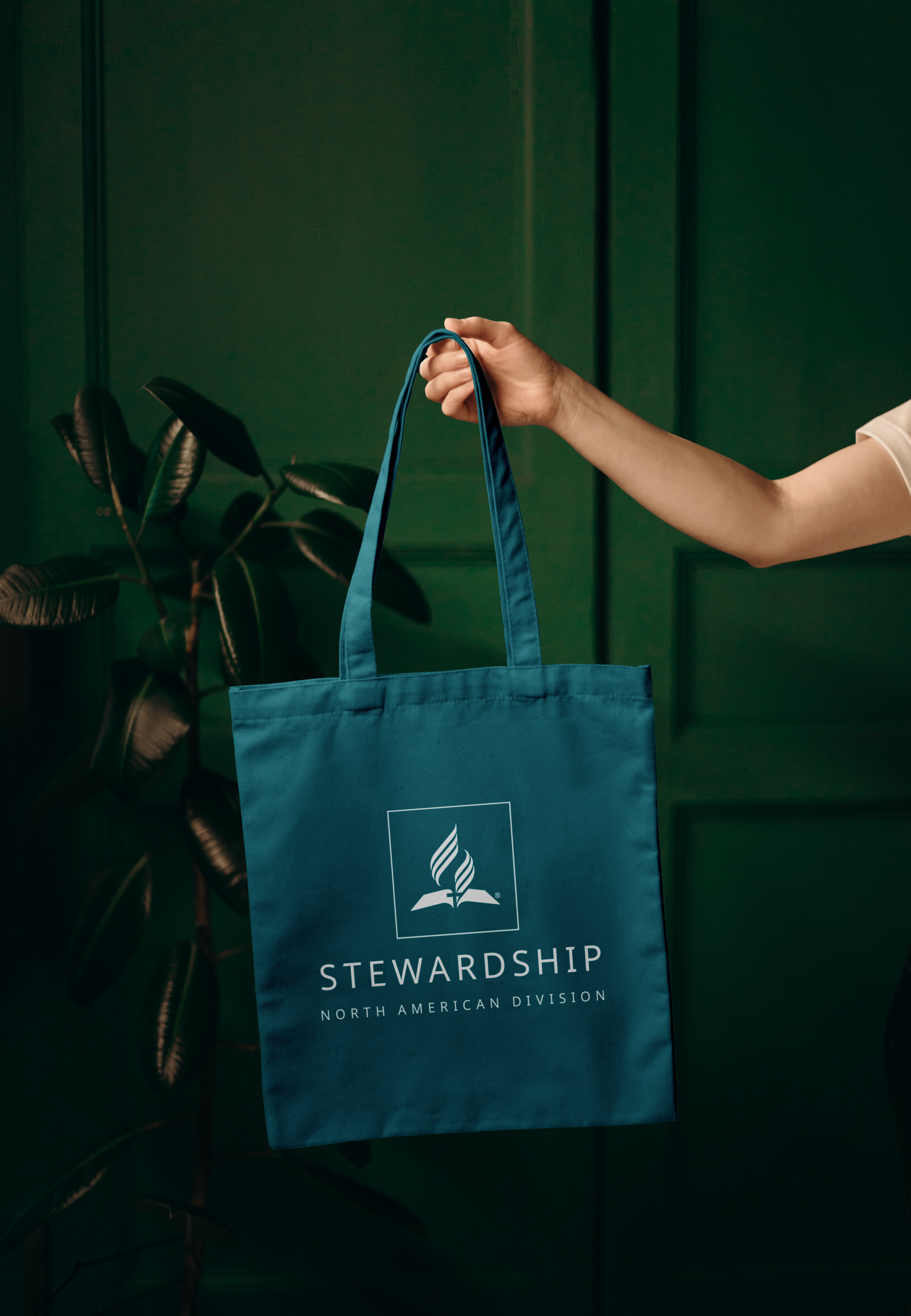
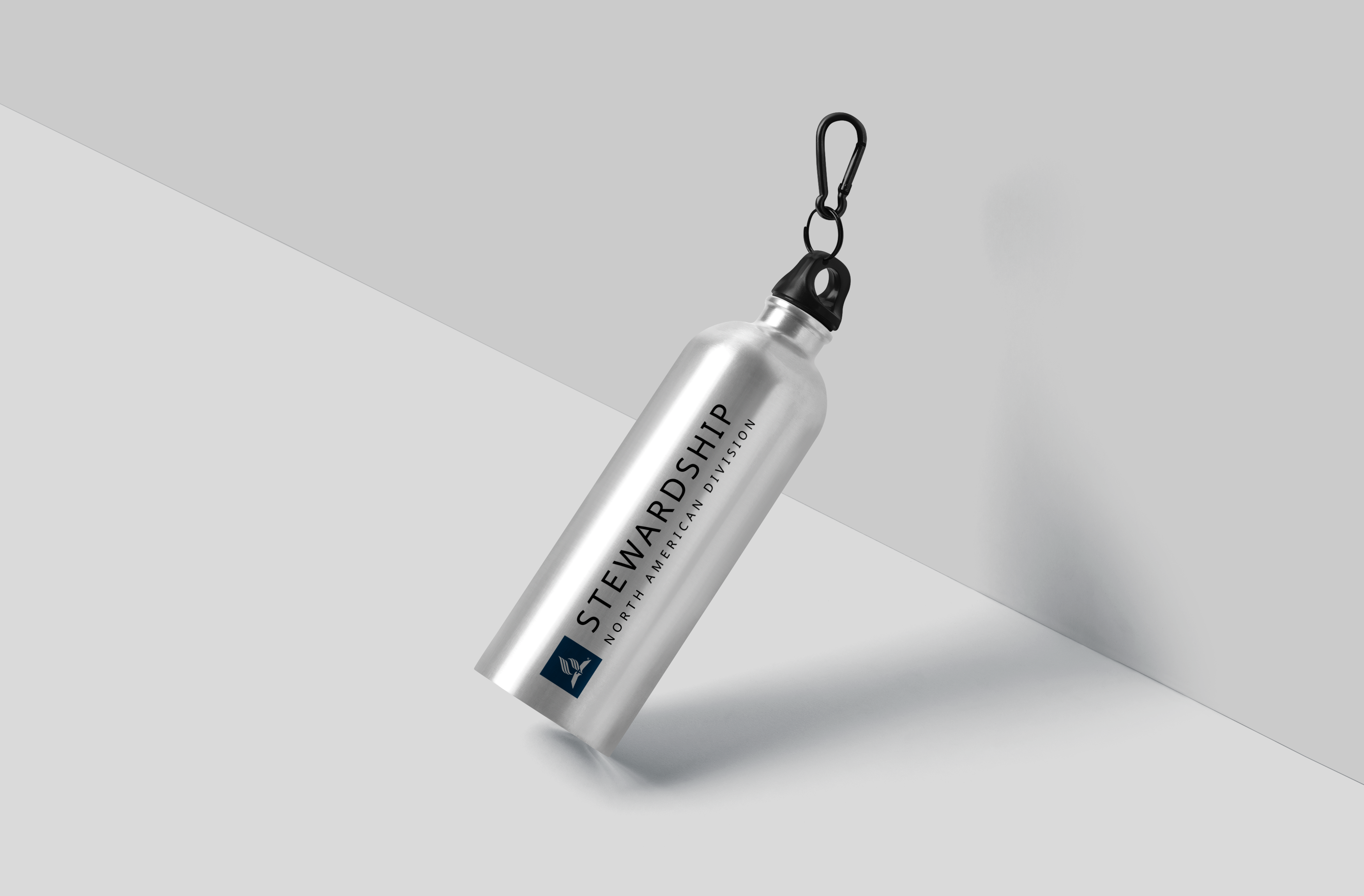
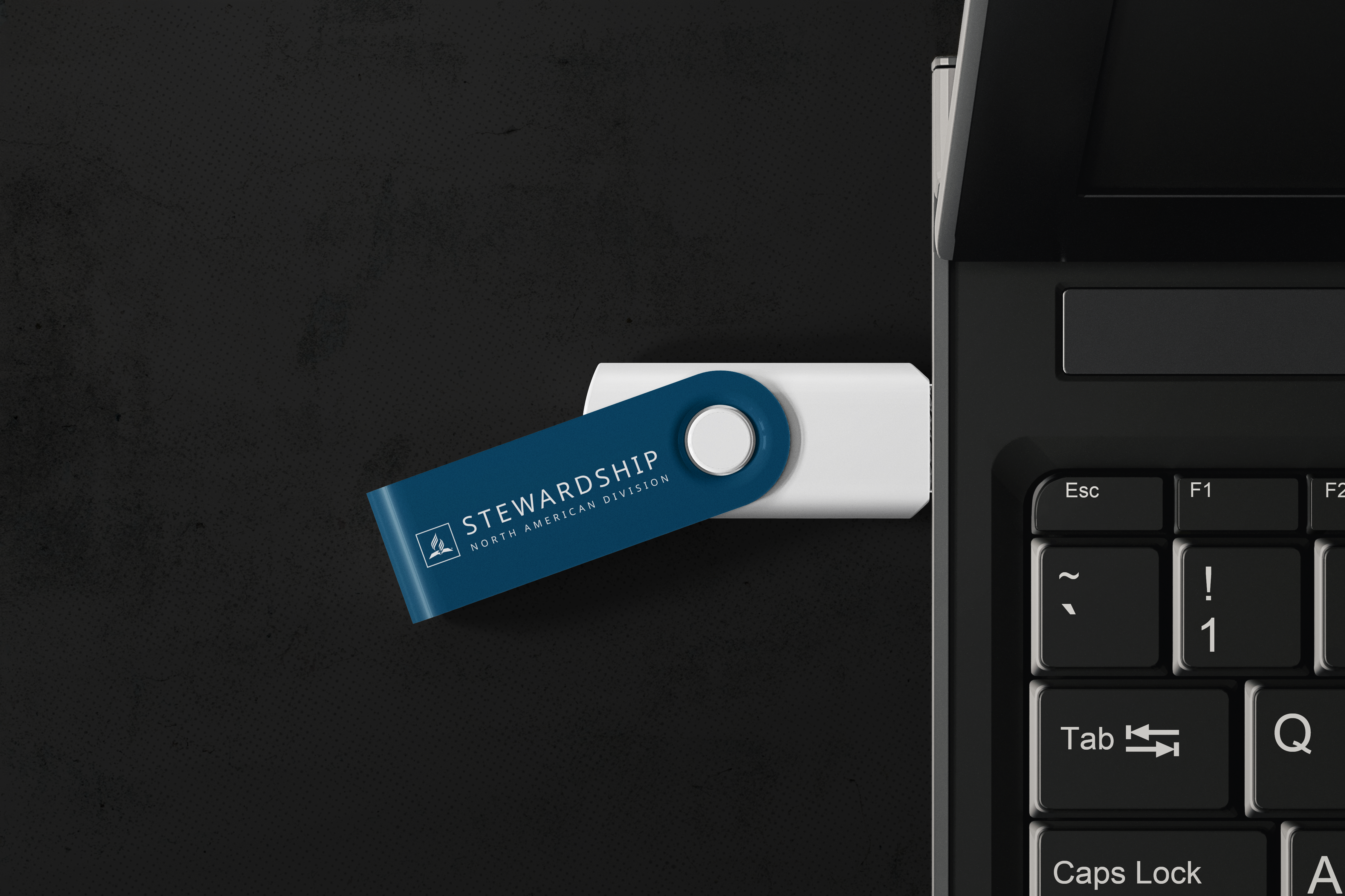
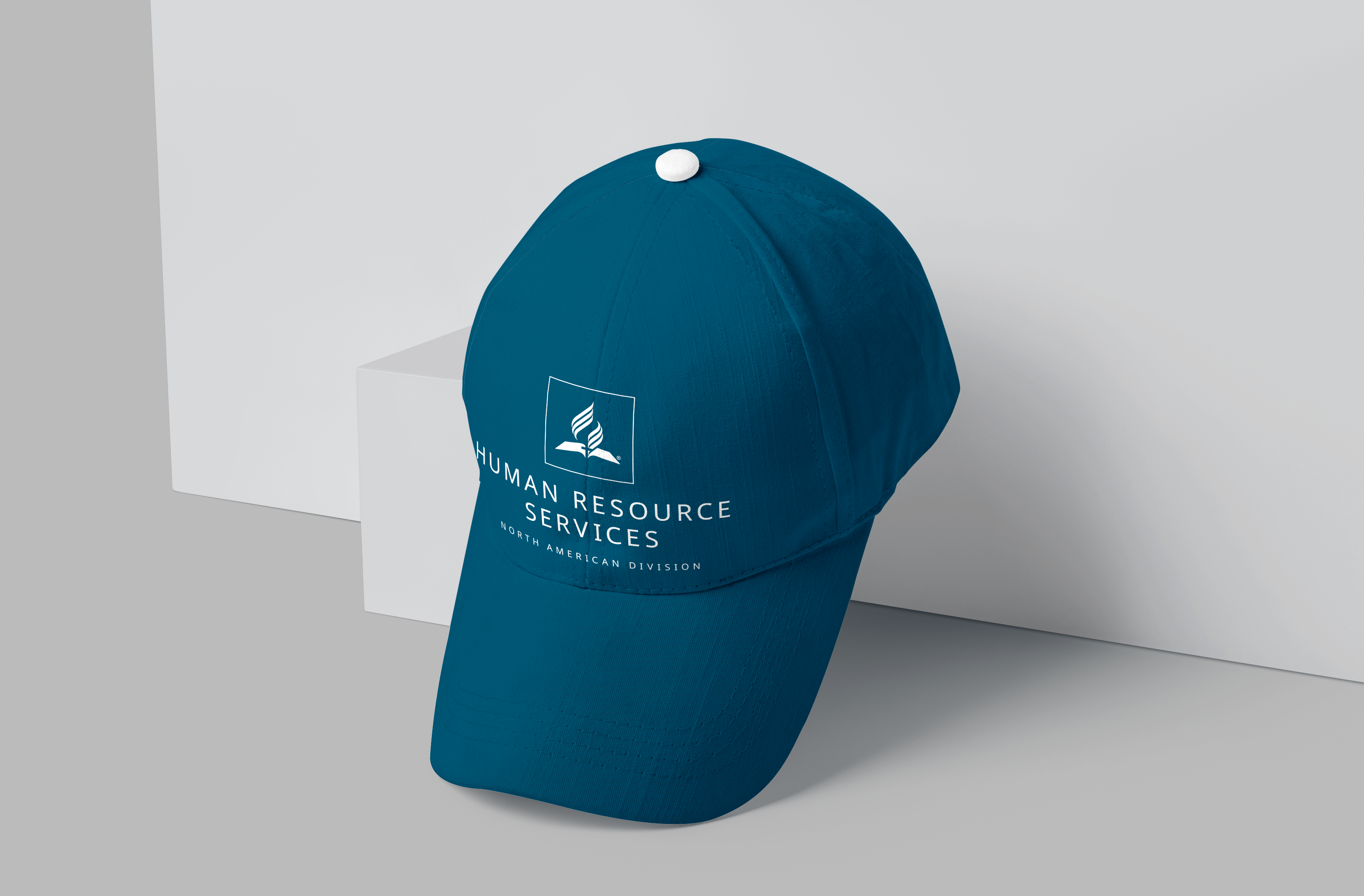
Promotional Item Alternates
“Most people make the mistake of thinking design is what it looks like. … It's not just what it looks like and feels like. Design is how it works.”— Steve Jobs, Apple Inc. co-founder, chairman, and CEO, in 2003

Former NAD President Dan Jackson with Human Resource Services staff wearing branded apparel.
This description is true with an organization’s visual identity design. And that design only works properly when it communicates the brand message of the organization. That is why the North American Division brand guidelines, which can be viewed as a living system that grows, flexes, and adapts — much like a family — are so important.
The brand extensions shared here serve to keep our visual identity intact while also allowing the freedom to implement the logo on projects so that the look is compatible and yet workable on a variety of products. Through this intentional design, we strive to marry look and feel with functionality.
The approved alternate logos — one-line department stacked, or two-line department stacked; and the one-line department wide, or two-line department wide — give the advantage of maintaining the overall look and feel of the current standards while increasing the visibility of the logos on products through larger font choices with less identifying typography.
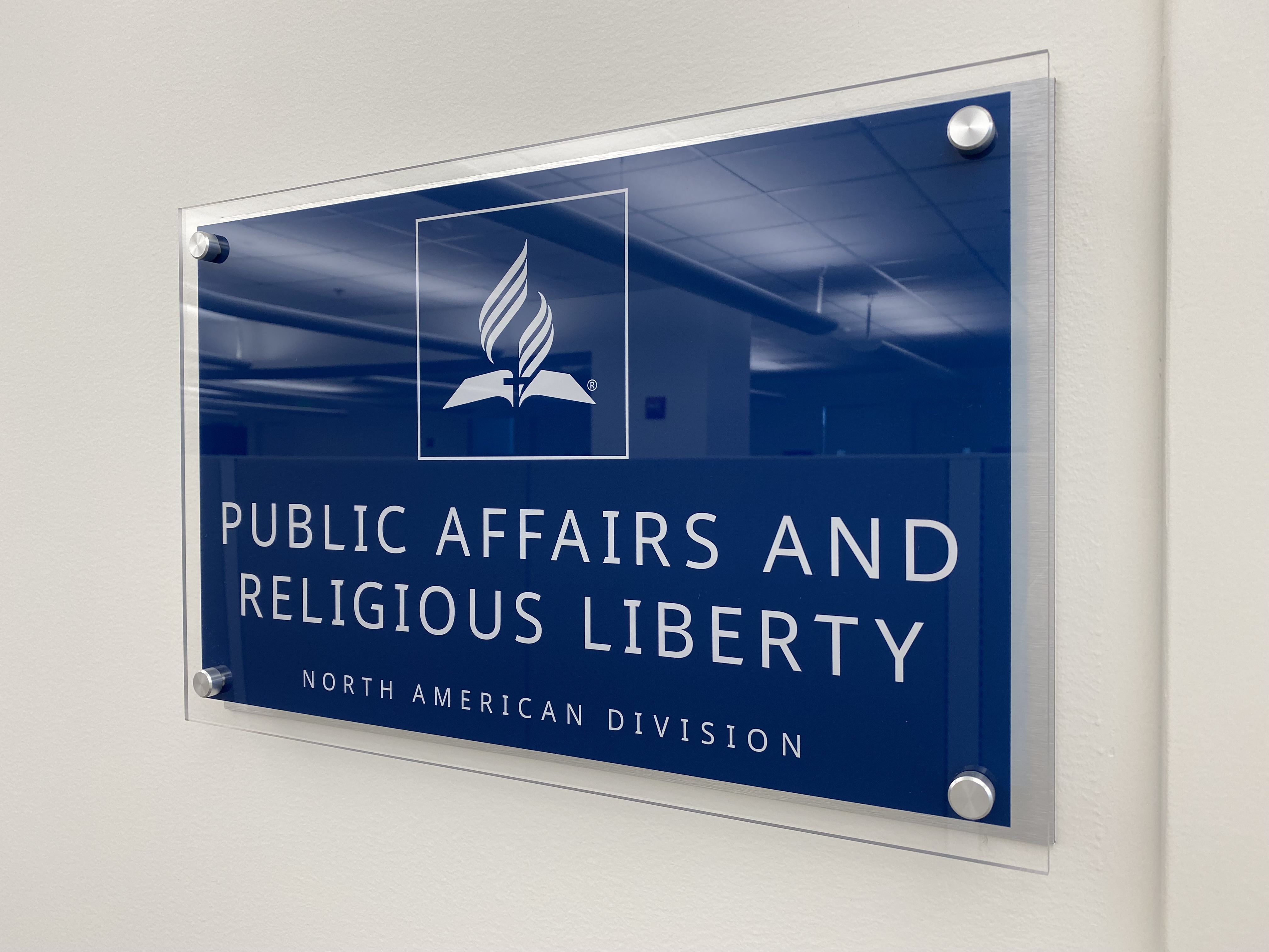
Public Affairs & Religious Liberty department signage in the NAD headquarters
For example, this translates particularly well when using the vertical two-line department stacked for office apparel, which matches the logo configurations inside the division headquarters (on office placards, wall signage, etc.), providing consistency as well as an overall collaborative and harmonious impression.
We encourage you to use these samples as a reference when developing communications, either print, or online, external or internal, to ensure that our logo, typography, and color palette remain consistent with our administration, ministries, and services. Through proper use of the logo, including the approved visual identity promotional item extensions displayed here, we communicate reliability, credibility, and unity.
We trust these alternate options, as we carefully nurture our brand and visual identity, will be of great value. Please reach out to us if you have questions at branding@nadadventist.org
Logo: Light on Dark
Two-Line Department Stacked
The white logo on denim blue background is preferred.
One-Line Department Stacked
The white logo on denim blue background is preferred.
Two-Line Department Wide
Note that two-line department names in the wide configuration lack the entity identifier, as a way to enable imprint at small sizes while maintaining legibility.

One-Line Department Wide
Note that one-line department names in the wide configuration include the entity identifier.

Download Alternate Logos Light on Dark
Zip files contain Light on Dark logos (stacked and wide) in the following file formats: AI.
-
All Light on Dark: English (ZIP, 1.2MB)
Logo: Dark on Light
Two-Line Department Stacked
The denim blue logo on white background is preferred in other cases.
One-Line Department Stacked
The denim blue logo on white background is preferred in other cases.
Two-Line Department Wide
Note that two-line department names in the wide configuration lack the entity identifier, as a way to enable imprint at small sizes while maintaining legibility.

One-Line Department Wide
Note that one-line department names in the wide configuration include the entity identifier.

Download Alternate Logos Dark on Light
Zip files contain Dark on Light logos (stacked and wide) in the following file formats: AI.
-
All Dark on Light: English (ZIP, 1.2MB)
Logo: Clear Space and Minimum Size
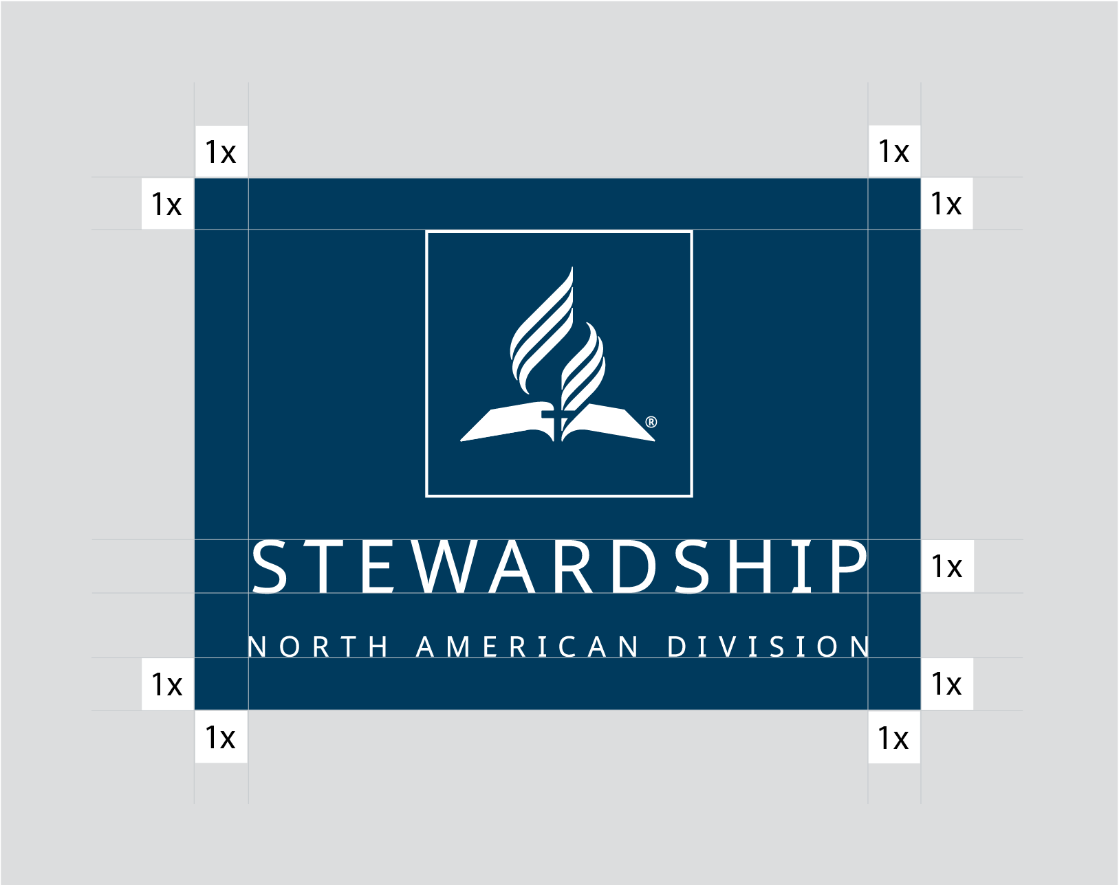
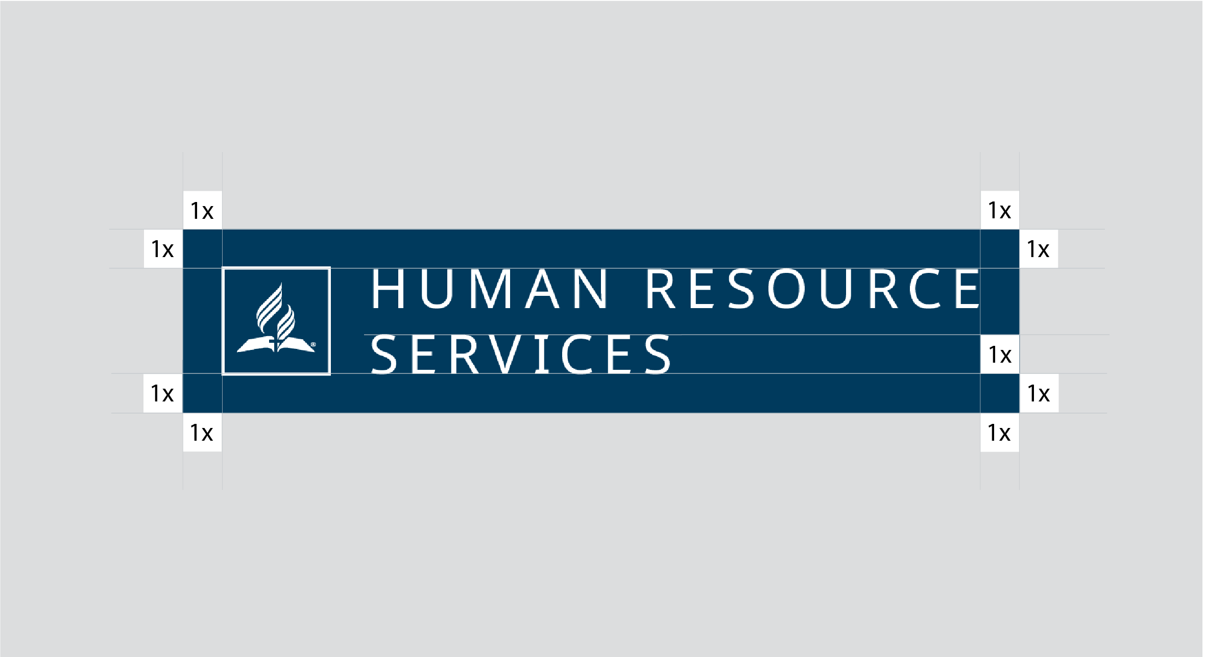
Maintain a clear space around the logo to ensure visibility and impact. To make sure it's easy to read, use a minimum of one times the height of the uppercase letters on all four sides of the alternate logo.
Department Stacked
Department Wide
Sample Usage
